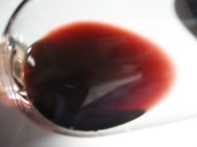
I thought it might be interesting to attempt to give a feel for the appearance of this wine photographically, with a view to perhaps doing this routinely in TN's in the future, although it would add some work. Take a look and let me know if you think it's worth it to have this kind of information.
Any technical hints out there for improving such images? This one was just with a glass held at an angle in front of a white sheet of paper under a bright light, using a 'macro' setting.
I love the idea of a photo to show the colour of the wine, that's partly what I was experimenting with when I chose my avatar.
However, I quickly realised that the colour of the wine varied according to the monitor that I used to view the pictures.
But I would still encourage people to add a photo because I think it fleshes out the description a little better. However, I would say the description will still remain the key component of the tasting note.
Alex
Last edited by Al B. on Thu Apr 05, 2007 1:14 pm, edited 1 time in total.
I haven’t seen the port, only the picture. Would it be correct to say something like “dark rich red, showing slight pinkiness at the edge, but neither blue nor brown”?
And to answer the original question: yes please, both would be ideal.
jdaw1 wrote:I haven’t seen the port, only the picture. Would it be correct to say something like “dark rich red, showing slight pinkiness at the edge, but neither blue nor brown”?
And to answer the original question: yes please, both would be ideal.
Of course, you put your finger on the problem, jdaw. The colors you see depend on so many electronic decisions that are outside the control of the ultimate user that you will likely see something much different, even when the color depth is set to maximum. So that does give a definite limit to the usefulness of this technique. I wonder if there's a way to increase color fidelity on the monitors we use?