
Kudos to Glenn for splitting off his first thread!
New FTLOP favicon?
Moderators: Glenn E., Roy Hersh, Andy Velebil
Re: new FTLOP favicon?
I could certainly live with #4 if it had a capital "O" instead of our current favicon. I said I'd keep an open mind. Thanks Andy. ![[friends.gif]](./images/smilies/friends.gif "Friends")
Kudos to Glenn for splitting off his first thread!
Kudos to Glenn for splitting off his first thread!
Ambition driven by passion, rather than money, is as strong an elixir as is Port. http://www.fortheloveofport.com
-
Julian D. A. Wiseman
- Posts: 714
- Joined: Sat Sep 09, 2006 7:54 pm
- Location: London, United Kingdom
- Contact:
Re: new FTLOP favicon?
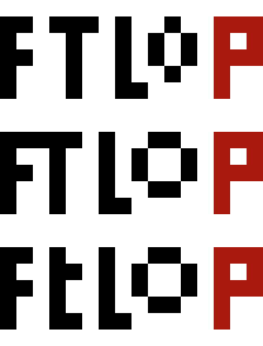
The next image is a 24× zoom of the top of 04. The image shows the full 16 pixels of width (2F+1+3T+1+2L+3o+1+3P = 16). So there really isn’t space spare.Andy Velebil wrote:I like #4. Though would be nice if the "O" would be the same size as the other letters.

Of course, if the ‘L’ were two pixels shorter, it could be nudged one leftwards without touching the T, thereby making space for a larger ‘O’. But that would be worse.
But, if wanted, the ‘o’ could come down a pixel. Or, in the style of the current icon, could be stretched to be taller than wide.
Re: new FTLOP favicon?
The O could be (010,101,101,010) instead of (010,101,010) as per your last comment, and I think would give a more similar size O in appearance as being asked for. Alternatively, the T could be modified to (10,11,10,10,11) instead of (111,010,010,010,010) thereby saving a column to allow for a full size O. I would expect to prefer the former.Julian D. A. Wiseman wrote:Of course, if the ‘L’ were two pixels shorter, it could be nudged one leftwards without touching the T, thereby making space for a larger ‘O’. But that would be worse.
But, if wanted, the ‘o’ could come down a pixel. Or, in the style of the current icon, could be stretched to be taller than wide.
Third option; when FTLOP is written, the top corners of the F and T often appear to meet (the gap can be imperceptible depending on font, viewing distance etc). For the favicon therefore, the T could potentially move one column left, with FT actually meeting, to allow full size O, without looking wrong when displayed as small favicon).
Apologies for lack of pictures, am sure Julian knows what I mean!
-
Julian D. A. Wiseman
- Posts: 714
- Joined: Sat Sep 09, 2006 7:54 pm
- Location: London, United Kingdom
- Contact:
Re: New FTLoP favicon?
Considering the letters rather than the bottles, please comment on the following (shown at natural size and at 24×).

-
Julian D. A. Wiseman
- Posts: 714
- Joined: Sat Sep 09, 2006 7:54 pm
- Location: London, United Kingdom
- Contact:
Re: New FTLoP favicon?
More:

Re: New FTLoP favicon?
Considering the above as variants 1 through 5 counting from the top: Despite suggesting it, I also don't like the small t in 3 and 5. Am not keen on the wide O in 2 and 3. 1 is definitely an improvement over the previous example with smaller O. 1 and 4 both seem to work for me, with a (minor) preference for 1. Am now going quite for a while, as I think I'm over-participating in this thread!Julian D. A. Wiseman wrote:Considering the letters rather than the bottles, please comment on the following (shown at natural size and at 24×).
-
Julian D. A. Wiseman
- Posts: 714
- Joined: Sat Sep 09, 2006 7:54 pm
- Location: London, United Kingdom
- Contact:
New FTLoP favicon?
Drafts:
00 =
01 =
02 =
03 =
04 =
05 =
06 =
07 =
08 =
09 =
10 =
11 =
12 =
13 =
14 =
17 =
18 =
19 =
20 =
21 =
22 =
23 = which, on a white background =
24 =
25 =
26 =
I like 18. Roy? Moderators? Others?
00 =
01 =
02 =
03 =
04 =
05 =
06 =
07 =
08 =
09 =
10 =
11 =
12 =
13 =
14 =
17 =
18 =
19 =
20 =
21 =
22 =
23 =
which, on a white background = 24 =
25 =
26 =
I like 18. Roy? Moderators? Others?
On a white background it might be better if the ‘labels’ were non-white: suggestions?Roy Hersh wrote:I could certainly live with #4 if it had a capital "O" instead of our current favicon. I said I'd keep an open mind.
Last edited by Julian D. A. Wiseman on Sat Feb 15, 2014 12:41 pm, edited 9 times in total.
-
Andy Velebil
- Posts: 16828
- Joined: Tue Aug 02, 2005 4:49 pm
- Location: Los Angeles, California, United States of America - USA
- Contact:
Re: New FTLoP favicon?
I still like the bottles in #4 the best. They match our new logo better than the others, given the small size.
I do like the FTLOP lettering of either #4 or #17. And prefer #17 lettering, as even when you type it here the F and the T almost touch.
I do like the FTLOP lettering of either #4 or #17. And prefer #17 lettering, as even when you type it here the F and the T almost touch.
Andy Velebil Good wine is a good familiar creature if it be well used. William Shakespeare http://www.fortheloveofport.com
-
Julian D. A. Wiseman
- Posts: 714
- Joined: Sat Sep 09, 2006 7:54 pm
- Location: London, United Kingdom
- Contact:
Re: New FTLoP favicon?
The bottles in #4 remind me too much of the Taj Mahal. I prefer gaps and labels.Andy Velebil wrote:I still like the bottles in #4 the best.
(Also, list was edited to add #18. Like? Dislike?)
-
Andy Velebil
- Posts: 16828
- Joined: Tue Aug 02, 2005 4:49 pm
- Location: Los Angeles, California, United States of America - USA
- Contact:
Re: New FTLoP favicon?
Maybe we like the Taj Mahal? And our new logo is bottles touching, so in that respect #4 bottles match the best to our new logo. Can you post a sample of #4 bottles with #17 lettering?Julian D. A. Wiseman wrote:The bottles in #4 remind me too much of the Taj Mahal. I prefer gaps and labels.Andy Velebil wrote:I still like the bottles in #4 the best.
(Also, list was edited to add #18. Like? Dislike?)
Andy Velebil Good wine is a good familiar creature if it be well used. William Shakespeare http://www.fortheloveofport.com
-
Julian D. A. Wiseman
- Posts: 714
- Joined: Sat Sep 09, 2006 7:54 pm
- Location: London, United Kingdom
- Contact:
Re: New FTLoP favicon?
{Letters above, letters below} × {Long necks, short necks} posted above as numbers 19 to 22.Andy Velebil wrote:Can you post a sample of #4 bottles with #17 lettering?
I prefer 18 to all four.
-
Andy Velebil
- Posts: 16828
- Joined: Tue Aug 02, 2005 4:49 pm
- Location: Los Angeles, California, United States of America - USA
- Contact:
Re: New FTLoP favicon?
#4 bottles as they appears your above "Draft" post, with #17 letters above it please
Andy Velebil Good wine is a good familiar creature if it be well used. William Shakespeare http://www.fortheloveofport.com
-
Julian D. A. Wiseman
- Posts: 714
- Joined: Sat Sep 09, 2006 7:54 pm
- Location: London, United Kingdom
- Contact:
Re: New FTLoP favicon?
= #19, surely.Andy Velebil wrote:#4 bottles as they appears your above "Draft" post, with #17 letters above it please
My new favourite:Julian D. A. Wiseman wrote:19 =
Julian D. A. Wiseman wrote:23 =
Last edited by Julian D. A. Wiseman on Sat Feb 15, 2014 12:53 pm, edited 1 time in total.
-
Glenn E.

- Posts: 8395
- Joined: Wed Jan 23, 2008 10:49 am
- Location: Sammamish, Washington, United States of America - USA
- Contact:
Re: New FTLoP favicon?
My new favorites are #17 and #23. I have a slight preference for #17 because I like having the letters above the bottles, but either would be great. I do like the non-white labels of #23, so using those on #17 would make it even better.
Glenn Elliott
-
Eric Menchen
- Posts: 6686
- Joined: Wed Sep 24, 2008 9:48 pm
- Location: Longmont, Colorado, United States of America - USA
Re: New FTLoP favicon?
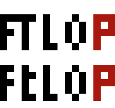
With the letters above, vertical space in FTLOP becomes an issue. Some people didn't like the little "o" and instead suggested a larger one. I was thinking the opposite--that the "t" and the "o" should both be small, as in title capitalization, For the Love of Port. Of course a small t without that little tab on the bottom looks like a cross at low resolution, so that might be a negative.
Also, whether big or small, I think experimenting with a few pixels of anti-aliasing might help on the "O" and "P", and "t" if is small with a tab, in which case the pixel at the bottom could be adjusted. For that matter, the bottles could be rounded with a few intermediate pixels for anti-aliasing.
Also, whether big or small, I think experimenting with a few pixels of anti-aliasing might help on the "O" and "P", and "t" if is small with a tab, in which case the pixel at the bottom could be adjusted. For that matter, the bottles could be rounded with a few intermediate pixels for anti-aliasing.
Re: New FTLoP favicon?
Not to minimize Julian's excellent efforts, but I'm not sure I understand the basic premise that this icon needs changing ![[shrug.gif]](./images/smilies/shrug.gif "Huh?")
As far as the small "o" in the old icon, might it make sense to shorten the "t" to match, thus creating a regularly alternating large/small/large/small/large pattern from letter to letter, with the two smaller letters being an article and a preposition. which would often not be capitalized in the actual title anyway?
As far as the small "o" in the old icon, might it make sense to shorten the "t" to match, thus creating a regularly alternating large/small/large/small/large pattern from letter to letter, with the two smaller letters being an article and a preposition. which would often not be capitalized in the actual title anyway?
Tom D.
-
Glenn E.
- Posts: 8395
- Joined: Wed Jan 23, 2008 10:49 am
- Location: Sammamish, Washington, United States of America - USA
- Contact:
Re: New FTLoP favicon?
I think that, officially, all 5 letters should be full height. Roy would have to chime in on that one, though.
Grammatically it seems like the 't' and the 'o' should be treated the same. FtLoP looks weird to me, though, so I prefer FTLOP.
Grammatically it seems like the 't' and the 'o' should be treated the same. FtLoP looks weird to me, though, so I prefer FTLOP.
Glenn Elliott
Re: New FTLoP favicon?
My choice would also be #23; I much prefer the letters below in considering #23 vs #17 styles.Glenn E. wrote:My new favorites are #17 and #23. I have a slight preference for #17 because I like having the letters above the bottles, but either would be great. I do like the non-white labels of #23, so using those on #17 would make it even better.
Agree.Glenn E. wrote:FtLoP looks weird to me, though, so I prefer FTLOP.
-
Julian D. A. Wiseman
- Posts: 714
- Joined: Sat Sep 09, 2006 7:54 pm
- Location: London, United Kingdom
- Contact:
Re: New FTLoP favicon?
I also prefer letters below, but, as requested, above:
But my preference still #23:Julian D. A. Wiseman wrote:24 =
Julian D. A. Wiseman wrote:23 =
Last edited by Julian D. A. Wiseman on Sat Feb 15, 2014 12:55 pm, edited 2 times in total.
-
Andy Velebil
- Posts: 16828
- Joined: Tue Aug 02, 2005 4:49 pm
- Location: Los Angeles, California, United States of America - USA
- Contact:
Re: New FTLoP favicon?
#19 I really like.
I say that as the bottles are the most similar to our newest logo on the main FTLOP page. It would be odd to have something significantly different than our actual logo. Just my
I say that as the bottles are the most similar to our newest logo on the main FTLOP page. It would be odd to have something significantly different than our actual logo. Just my
Andy Velebil Good wine is a good familiar creature if it be well used. William Shakespeare http://www.fortheloveofport.com